Effective logo placement on tank tops enhances brand visibility and creates a stylish impression. It balances aesthetics with functionality, ensuring designs are both visually appealing and practical for wear.
1.1 Importance of Logo Placement in Branding
Strategic logo placement on tank tops is crucial for brand recognition and visibility. It ensures your design stands out, creating a lasting impression. Front placement is ideal for bold branding, while left chest or back placements offer subtle yet effective alternatives. Proper positioning enhances wearer confidence and brand appeal, making it a key element in successful marketing campaigns. Balancing size, style, and location ensures your logo is both aesthetic and functional, maximizing its impact on potential customers.
1.2 Overview of Tank Top Designs and Styles
Tank tops vary in designs, from racerback to muscle styles, each offering unique opportunities for logo placement. Racerback styles provide a bold canvas for back logos, while muscle tees allow for larger, eye-catching designs. The choice of style influences where and how the logo is displayed, ensuring it complements the garment’s aesthetic. Understanding these variations helps in selecting the most suitable placement for optimal visual appeal and brand impact. Different styles cater to diverse preferences, making tank tops versatile for various branding needs.

Understanding Target Audience and Intended Use
Identifying the target audience and intended use of tank tops is crucial for effective logo placement. It ensures designs resonate with wearers and align with the brand’s purpose, making a statement while maintaining practicality.
2.1 Branding Goals and Visibility Needs
Branding goals and visibility needs are central to logo placement on tank tops. Front placement maximizes visibility, making it ideal for promotional purposes. Left chest logos offer subtle branding, while back placement provides bold, eye-catching exposure. Ensuring the logo remains visible across different sizes and styles is key to achieving consistent brand recognition and appeal. Understanding these elements helps tailor designs to meet specific branding objectives effectively.
2.2 Specific Use Cases for Logo Placement
Logo placement on tank tops varies based on use cases. For promotional events, bold back logos ensure maximum visibility. In retail settings, smaller left chest logos offer a subtle yet professional look. Athletic wear often features centered front logos for a clean, sporty appearance. Additionally, creative sleeve placements are ideal for modern, fashion-forward designs. Each use case demands a tailored approach to ensure the logo complements the garment’s purpose and style, enhancing both functionality and aesthetic appeal.
Popular Logo Placement Options for Tank Tops
Popular logo placements include front, back, left chest, and sleeves. Each offers unique visibility and style benefits, catering to different branding and design objectives effectively.
3.1 Front Placement: Classic and Visible
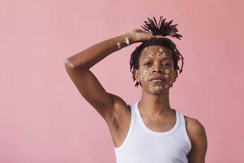
Front placement is the most common and visible option for tank tops, ideal for branding. Logos are typically centered and placed 3 inches below the collar for a balanced look. This placement ensures maximum visibility, making it perfect for promotional purposes. It works well for both small and large designs, though oversized logos should avoid the belly area to maintain aesthetics. Front placement is versatile and suits various styles, from casual to athletic wear, ensuring the design remains a focal point.
3.2 Left Chest Placement: Subtle yet Noticeable
Left chest placement offers a subtle yet professional look, perfect for smaller logos. The design is positioned 3-3.5 inches from the collar’s center, ensuring it doesn’t overwhelm the garment. This placement is ideal for minimalist branding, often used in corporate or athletic apparel. It maintains visibility without being overpowering, making it a popular choice for understated designs. The logo remains noticeable while blending seamlessly with the tank top’s style, providing a clean and elegant appearance.
3.3 Back Placement: Bold and Eye-Catching
Back placement is ideal for bold, eye-catching designs, offering a larger canvas for logos or graphics. Typically positioned 6 inches from the collar’s seam, this placement ensures maximum visibility. It’s perfect for event graphics or promotional campaigns, as the design stands out when the wearer turns. The back print should avoid overcrowding to maintain clarity and balance. This placement is a popular choice for businesses aiming to make a strong, memorable statement with their branding. It ensures the logo remains visible and impactful.
Sleeve placement adds a modern twist, perfect for creative designs. Logos are typically centered or placed near the top of the sleeve, no wider than 3 inches. This subtle yet stylish approach works well for trendy brands targeting fashion-conscious audiences. Sleeve placement avoids clutter and ensures the design complements the tank top’s simplicity. It’s ideal for smaller logos or intricate artwork, offering a unique way to enhance brand visibility without overpowering the garment. This placement is both functional and aesthetically pleasing. Tank top size and style impact logo visibility. Larger logos may not fit smaller sizes, while racerback or muscle styles require adjusted placement for balanced aesthetics and functionality. The size of the tank top significantly influences logo visibility. Smaller tank tops require smaller logos to avoid overwhelming the design space, while larger sizes can accommodate bigger designs. Proper scaling ensures the logo remains balanced and proportional. Additionally, the fit of the tank top, such as racerback or muscle styles, affects how the logo appears when worn. Always test the design on different sizes to ensure visibility and aesthetic appeal. Racerback and muscle-style tank tops have unique designs that influence logo placement. Racerback styles often feature a wider shoulder area, making the back a prime spot for bold logos. Muscle tees, with their broader chest and back, allow for larger, more eye-catching designs. The shape and fabric of these styles can stretch or distort logos, so careful consideration is needed to ensure the design remains intact and visually appealing when worn. This ensures the logo looks great and maintains its intended appearance. Logo design must balance size, symmetry, and style to complement tank top aesthetics. Simplicity and contrast enhance visibility, ensuring logos stand out while maintaining a polished look. Logo size is crucial for tank top placement. A general rule is to keep logos under 4 inches, with 3-3.5 inches being ideal for front or chest placements. Oversized logos can overwhelm the garment, while too-small designs may lack impact. Ensure the logo proportions align with the tank top’s style, such as racerback or muscle, to maintain balance and visual appeal. Proper sizing ensures the logo is both noticeable and flattering on various body types and garment sizes. Symmetry and balance are essential for a polished look. Centering logos on the chest or back ensures a professional appearance. Align designs with the garment’s natural lines, such as the collar or hem, to maintain visual harmony. For asymmetrical designs, placement near the left chest or sleeve creates a modern, balanced aesthetic without overwhelming the wearer. Proper alignment enhances brand appeal and ensures the logo complements the tank top’s style, whether it’s racerback, muscle, or classic. Utilize a tailor’s measuring tape and platen setup for precise logo placement. These tools ensure accuracy and consistency, especially for varying tank top sizes and styles. A tailor’s measuring tape is essential for precise logo placement on tank tops. Its flexibility allows accurate measurements, ensuring designs align well with seams and hems. Use it to mark the center point and desired height for the logo, ensuring consistency across different sizes. This tool helps maintain symmetry and balance, critical for a professional finish. Regular use streamlines the design process, making it easier to achieve optimal placement every time. Proper setup of the squeegee and platen ensures consistent logo printing on tank tops. The squeegee should be 1-2 inches wider than the design on each side for smooth ink flow. Platens must be aligned with the garment, considering its style, such as racerback or muscle cuts. Using the right size and type of platen, like youth or sleeve platens, prevents misalignment. Regular calibration and testing on smaller sizes help achieve precise, high-quality prints across all tank top designs and sizes. Industry standards dictate consistent logo placement, ensuring professionalism and quality. Best practices include precise measurements, proper equipment setup, and adherence to established guidelines for optimal results. Standard placement guidelines for screen printing on tank tops emphasize precise positioning to ensure visual appeal and functionality. Front logos are typically placed 1-2 inches below the neckline, centered for maximum visibility. For left chest designs, the logo should be 3-3.5 inches wide, positioned 3-4 inches from the collar and 1-2 inches from the left seam. Back logos are usually 6-9 inches below the collar, centered for balance. Sleeve prints should be no wider than 3 inches to avoid distortion. Proper alignment and spacing ensure the logo remains proportional to the garment, enhancing both aesthetics and brand recognition. Adhering to these guidelines ensures consistent, professional results across all tank top designs. Logo placement must be adjusted for different garment sizes to ensure consistency and visual appeal. Smaller sizes require smaller logos, while larger sizes may need proportionally bigger designs. For youth or petite sizes, logos should be scaled down to fit naturally, avoiding overcrowding. Larger garments may need logos positioned slightly lower to maintain balance. Using a tailor’s measuring tape helps precise adjustments, ensuring the logo remains centered and proportional across all sizes. This ensures a polished look regardless of the wearer’s size. Proper scaling enhances brand visibility and aesthetic consistency. Avoid overcrowding the design space and ensure logos are balanced. Ignoring garment style differences, like racerback or muscle cuts, can lead to poor visibility and uneven placement. Overcrowding the design space can make logos appear cluttered and unprofessional. Ensure sufficient space around the logo to maintain a clean look. Avoid placing multiple elements too close together, as this can overwhelm the viewer. Keep logos proportional to the tank top size, with smaller designs for subtle branding and larger ones for bold statements. Balancing the design ensures clarity and visual appeal, making the logo stand out without overwhelming the garment. Proper spacing enhances both aesthetics and brand visibility effectively. Different tank top styles, such as racerback or muscle designs, require tailored logo placement strategies. Failing to consider these variations can result in poor print alignment or visibility. For instance, racerback styles may benefit from centered back logos, while muscle tees might suit larger front prints. Adapting your design approach to each garment style ensures a polished and professional look, avoiding mismatched placements that can detract from the overall aesthetic and brand impact. This attention to detail is crucial for achieving optimal results in logo placement. Strategic logo placement on tank tops is crucial for maximizing brand visibility and style. Consider garment differences, balance, and size to ensure a polished, professional finish that enhances branding success. Effective logo placement on tank tops involves balancing visibility and style. Front placement offers classic visibility, while left chest provides subtlety. Back placement makes a bold statement, and sleeve placement adds a modern touch. Consider garment size, logo proportions, and design symmetry to ensure optimal appeal. Testing designs on different styles, like racerback or muscle tees, ensures versatility. By aligning placement with branding goals, you create a cohesive look that enhances both aesthetic and functional aspects of the tank top. For successful logo placement, consider testing designs on various tank top styles to ensure consistency. Use a tailor’s measuring tape for precise alignment and maintain symmetry for a polished look. Avoid overcrowding and adapt designs to different garment sizes. Ensure logos are proportional and positioned to avoid distortion. Prioritize high-quality materials and techniques, like screen printing, for durability. Finally, seek feedback to refine designs, ensuring your logo stands out while complementing the tank top’s aesthetic. This approach guarantees a professional and visually appealing result.3;4 Sleeve Placement: Creative and Modern

Size and Style Considerations
4.1 How Tank Top Size Affects Logo Visibility
4.2 Impact of Tank Top Design (Racerback, Muscle Style)
Design Considerations for Logos
5.1 Logo Size Recommendations
5.2 Symmetry and Balance in Logo Placement

Tools and Techniques for Measuring Placement
6.1 Using Tailors Measuring Tape for Accuracy
6.2 Squeegee and Platen Setup for Consistent Prints

Industry Standards and Best Practices
7;1 Standard Placement Guidelines for Screen Printing
7.2 Adjusting for Different Garment Sizes

Common Mistakes to Avoid
8.1 Overcrowding the Design Space
8.2 Ignoring Garment Style Differences
9.1 Recap of Key Placement Strategies
9.2 Final Tips for Effective Logo Placement